|
Our second project was Metamorphosis - y'know, the whole caterpillar into a butterfly ordeal. Our job, though, was to create a piece that demonstrated metamorphosis while also being creative and original. I already hated the project from LAST year, in Portfolio, where I made my least favorite piece. So, I was looking forward to really crushing this one. 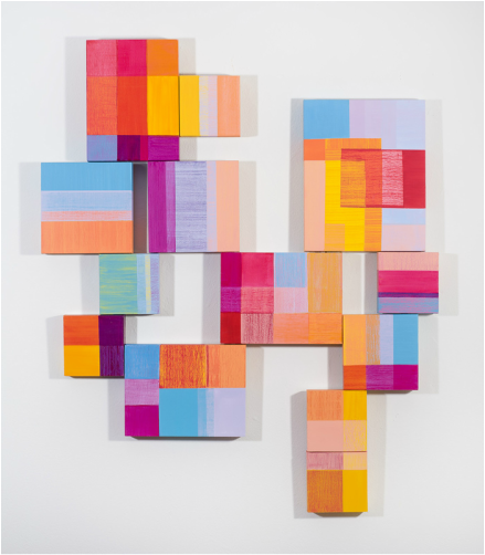 My inspiration for the composition was from a local (Pennsylvanian) artist and their piece: Diane Lachman's Summer. I saw it over at Art of the State. I loved the movement of the different panels, and was interested in doing something similar for my Metamorphosis. My concept was to create a metamorphosis of style rather than subject; to create a looser image forming into a well refined image. You'll see how that didn't exactly work out later... 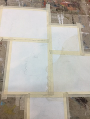 Here, I painted on the faces with slight overlap. I wanted there to be a history of the overlapping of the woman's face. I also did a light wash of blue to contrast the warm colors I was planning on using. 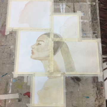 Here is the underpainting here, with a well refined image in the center. My plan was going to have this most defined face here be the most refined one. 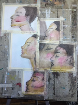 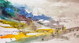 Here is where it began to fall apart. I had defined the other portraits, but they just weren't doing what I wanted them to do. I tried looking at examples of watercolor sketches, with loose pigmentation, and tried to mimic that style in my work. Instead of looking intentional, however, the piece looked muddy, messy, and overall unskilled. I also used a "Sketch and Wash" pencil, which is used like charcoal. It also made everything messy. On multiple occasions did I just soak the piece in water and rubbed away pigment. I was certainly getting frustrated with this thing. I even had to text Mrs. Maclay. 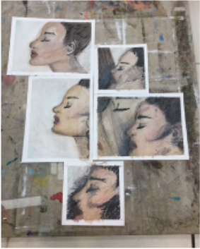 This is the final piece, tape removed. As you can tell, I removed practically all of that messy color and just went in with a charcoal water pencil and pen. I made the lowest transition too dark, but I'm overall pretty happy with how it turned out through my struggle of the weekend. It certainly, unfortunately, is not my best work. I think it is a fascinating piece, but it is a little busy in the right-most panel. I really do like it, moreso than my Scholastic.
If I were to do it again, I would certainly try and mess it up from the beginning, or start painting them simultaneously and just stop each way. I would also get rid of that weird larger face. I like the variety of it, but the other faces on top of that just made it a mess. I think I will use the concept of multiple panels for later works. Now, I just hope I will have a piece I'm proud of for Social Commentary!
0 Comments
Leave a Reply. |
